Reverse design: The video
shouldn’t be longer than 1 minute.
It shouldn’t show the corporate side or be too technical
It shouldn’t be outdated
It shouldn’t spend too much time on just one aspect
It shouldn’t have people talking and subtitles.
It shouldn’t have one wide shot for the who video
It shouldn’t look child like
I will refer back to these points when creating the graphics.
I found this video to be quite informative and i find that it makes sense. However as a group we have skipped all but the last 2-3 steps but I’m hoping to follow it when doing my graphics.
First step: Sense Intent. Trend? So the trend is making garments with quality in colour. The colour monitor that we are trying to promote obviously fits in with this
In the Ascolour website, they tell us that they design and produce clothing.
‘System®, PMS colours) for your reference. Some colours can’t be accurately reproduced because of the unique characteristics of certain fabrics; when possible, please refer to an actual garment.’ (Ascolour, 2017).
The clothing industry will always need to have some sort of quality control if they are to sell to customers which makes C-TEX’s product desirable.
In terms of my role working in motion graphics, I would need to finds out what is the trend in promotional video.( I have already done this and it was the starting point of the research).
The trend now seems to be animated objects, hand drawn looking animation. It is simple and rustic looking sometimes. There is usually either vibrant colours or colour themes i.e videos that only show 2 or 3 colours in the video. There is also quick shots or motion to create excitement and enthusiasm.

Know context.This is about the product and the company. I will talk more about this in my next post talking about my time at the C-TEX company.
Know people.
This is about people motivations. If I understand this, it could help me produce something that would be effective within the market.
From researching various promotional videos, I have learned about what catches the eyes of customers.
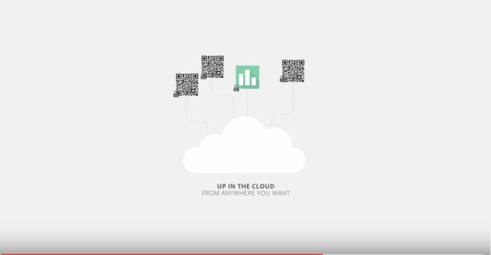
This video is interesting, it keep the viewer entertained. This video has injected colour and hand drawn style motion graphics. It has that fairly messy look but there is always something going on. I would like to produce something similar to our video. From the other videos I have looked at in previous posts, they also go along the same lines.
Frame insights.
So I have found the information I need so I need to put it together and start to understand it in order to make something. So I know that it is important to make sure the message is explained clearly in my graphics. I.e if i have graphics of machinery moving, it is clear to what it does by the motions.
Explore concepts
We have already decided to go with the Friendly concept where it shows the community and calm and relaxed nature of the C-TEX company. Concepts of what the motion graphics will look like in the video will be discussed with Will M, Will C and Raed. Sketches of this will be drawn up and finally created digitally.
Frame solutions. Our concepts will then be combined to create a final product.
Realise offerings.
prototypes of our graphics work will then be tested. Our research will be implemented into our work and from our feedback, we will make the necessary changes.
